The client briefed us for a memorable and timeless logo that fits in any culture and reflects their love and passion to nuts. During the kick-off meeting I wrote the sentence below from William Lidwell which i had been contemplating for a while. It is so correct and I was determined to give this fact a try on this project.
“Our brains have learned to pay special attention to incomplete patterns, reflexively completing them by filling in the missing data. Using this reflex, we can grab attention by simply obscuring parts of a logo.”
Since of Logo Design, William Lidwell
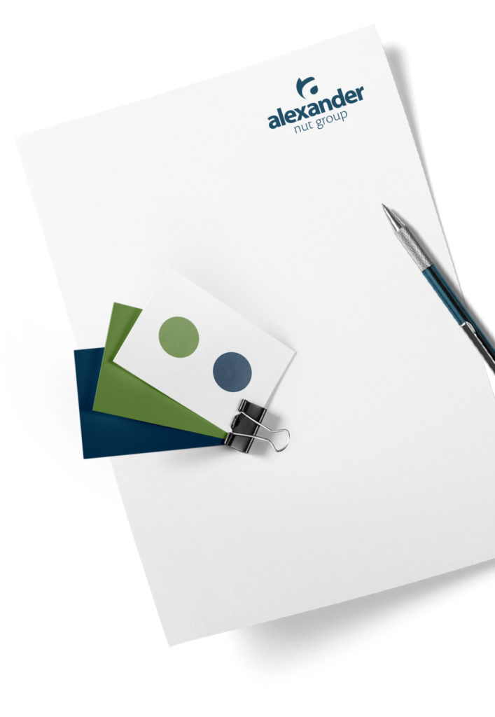
Using the lower case “a” for Alexander, instead of a capitalised one, demonstrates friendliness and modesty. The Word-mark’s close kerning and nearly pure geometric letters emphasise a non arrogant approach. The leaf as a symbol of nature, the nut and the obscured “a” all together build a memorable, accessible and mature sign, in an honest way.
Background
Alexander group and its staff are absolutely passionate about nuts – in all their forms, colors and varieties. They know where the most supreme nuts are harvested round the globe. They select them with care, transform them into unique nut products and sell them worldwide – in more than 80 countries of the world. As a sister company of Lorenz Snack-World, they confide in reliable and experienced sales partners.